JetBrains announced the new UI last year and stated that it will gradually and completely revamp the UI of the IntelliJ-based IDE to provide developers with a more modern, customizable and user-friendly interface, thereby improving the overall coding experience. Since then, the IDEA team has successively applied the new UI to the new version in order to obtain feedback for optimization.
Recently, the official focused on introducing the noteworthy changes of the new UI.
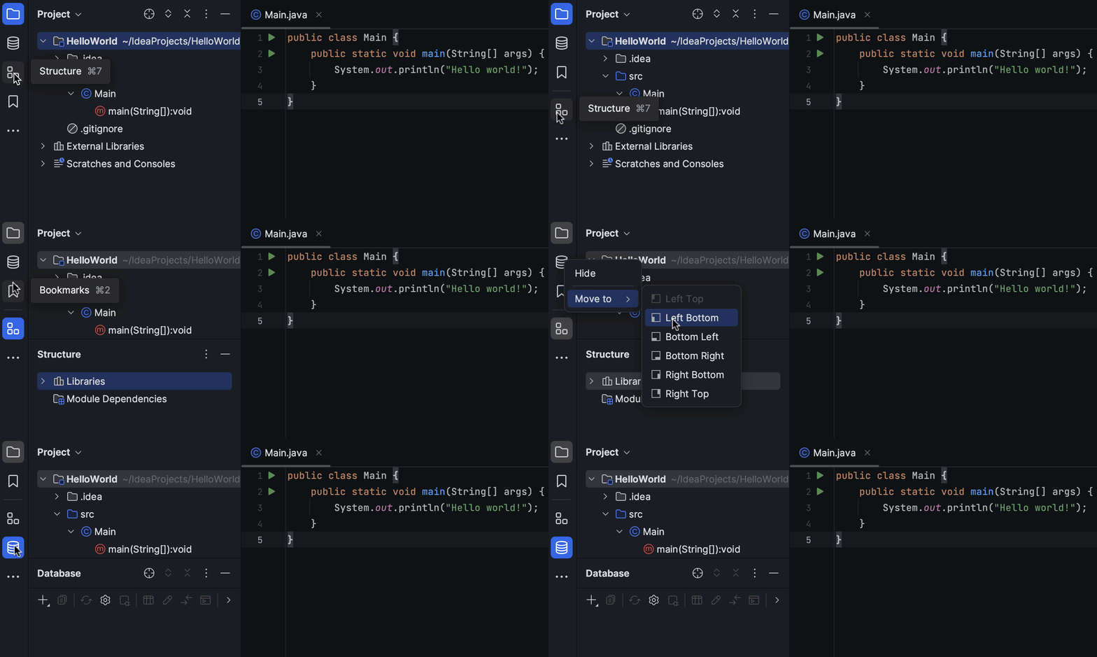
- Added option to split tool window area vertically
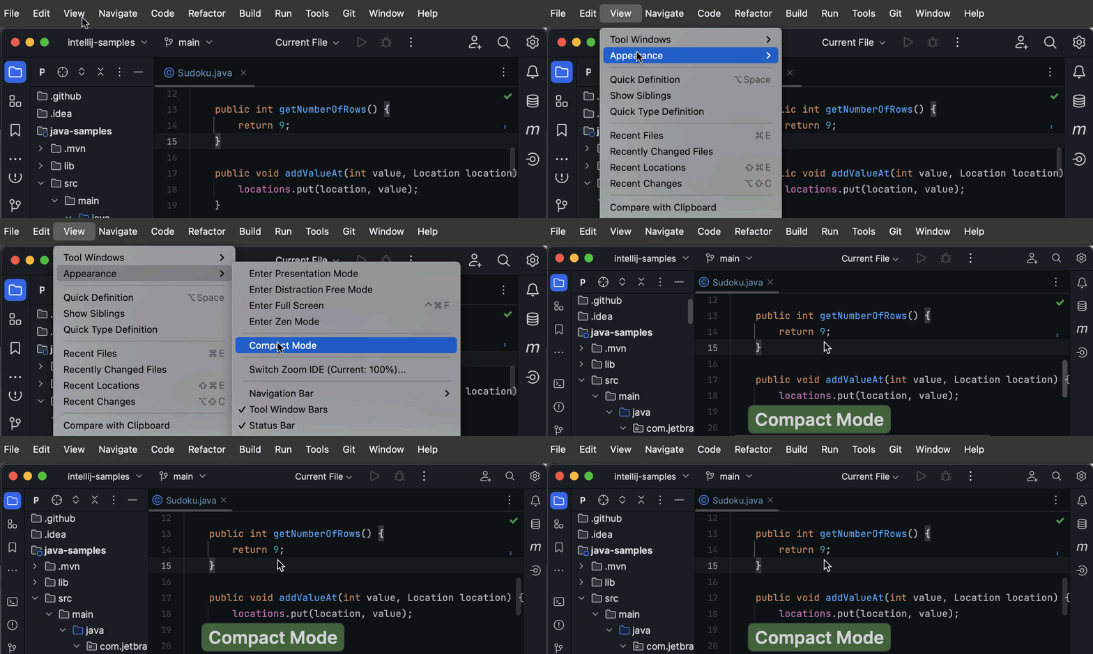
This mode provides a more uniform look by reducing the height of toolbars and tool window titles, reducing spacing and padding, and using smaller icons and buttons. Primarily intended for use on small screens or laptops.
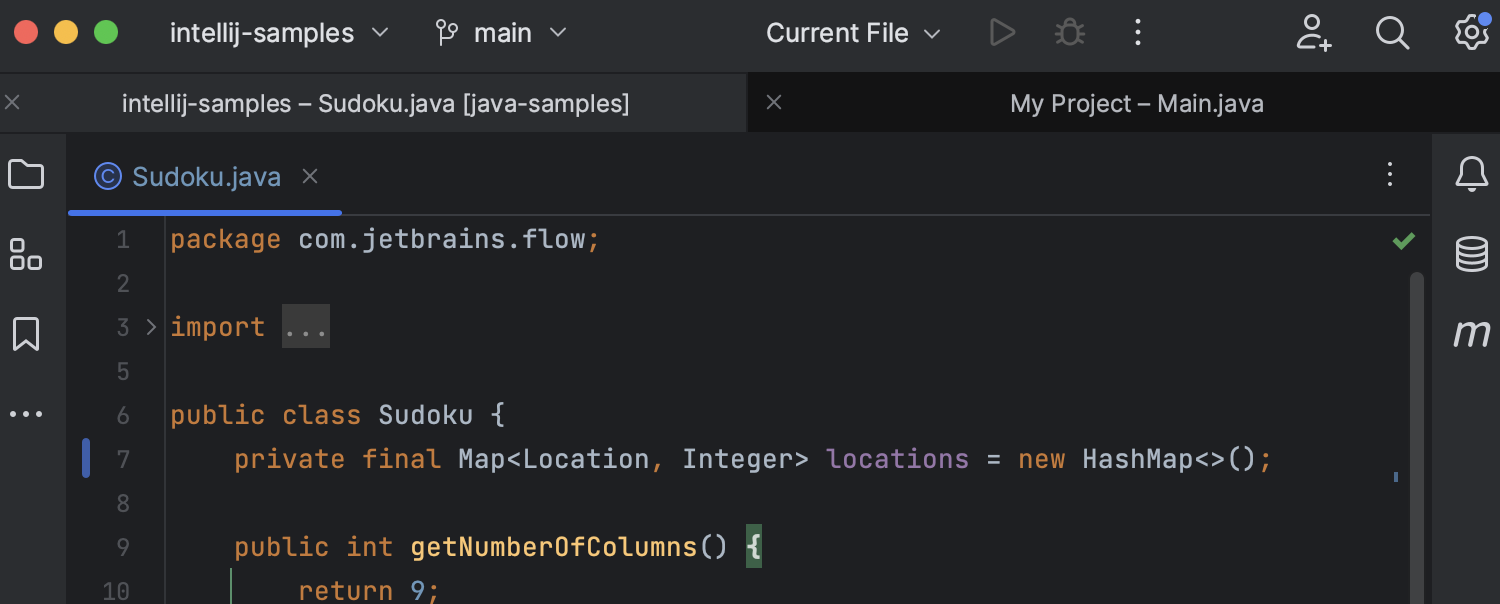
- The macOS version introduces tabs for Projects
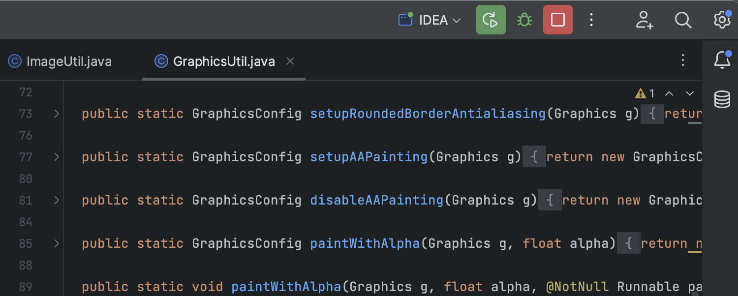
- Redesigned “Run” widget
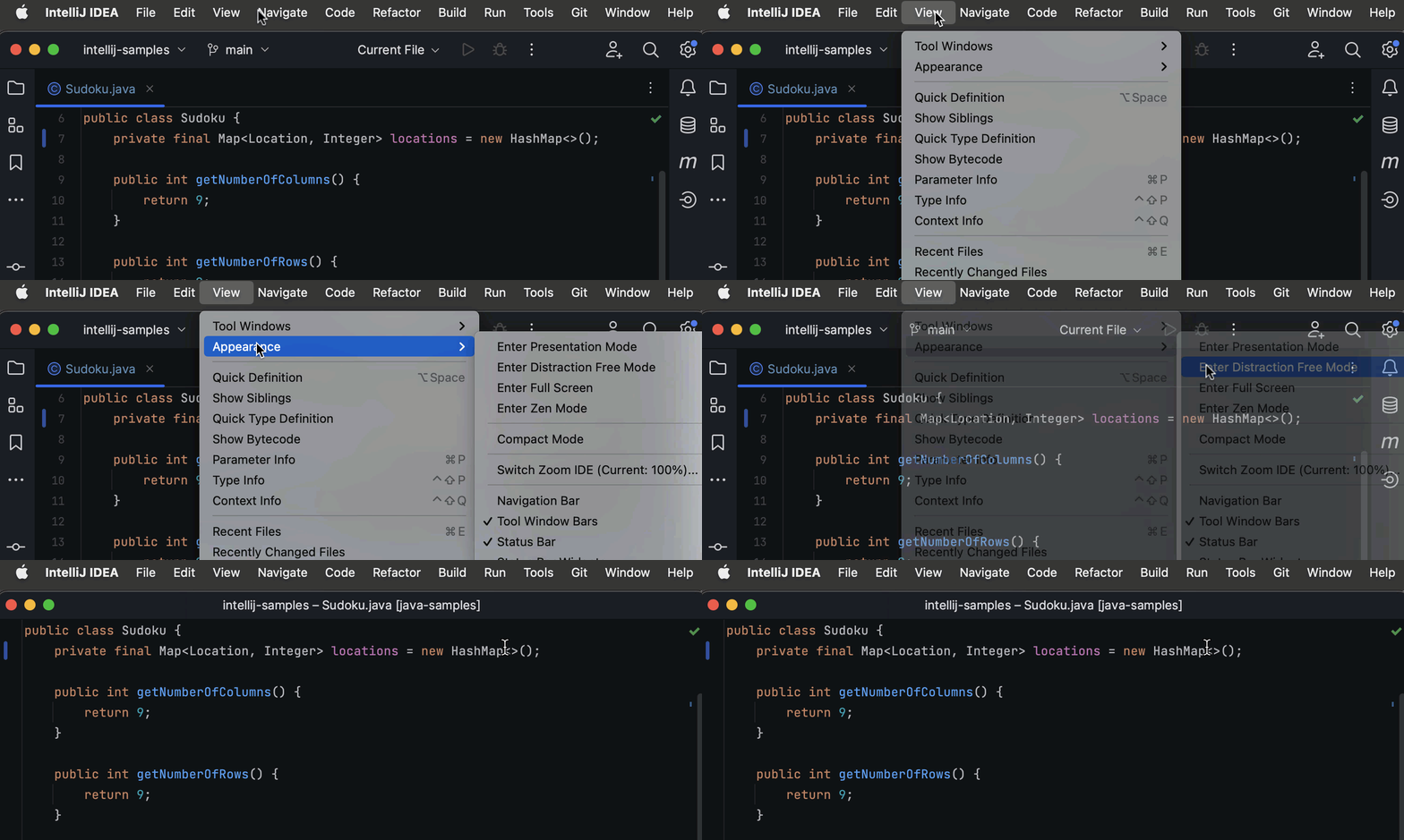
- Support for hideable toolbars in Zen and Distraction Free modes
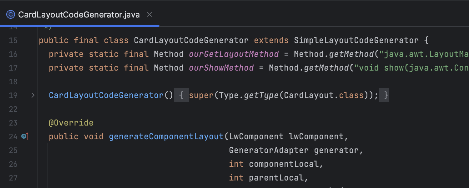
- Dark Editor introduces new color schemes
The new UI provides a new dark option for the default editor color scheme, which is automatically activated when the new UI is enabled.
JetBrains said that the new UI is still in the Beta stage, so we hope you can actively experience and provide feedback.
complete content.
#quick #IntelliJ #IDEA #News Fast Delivery