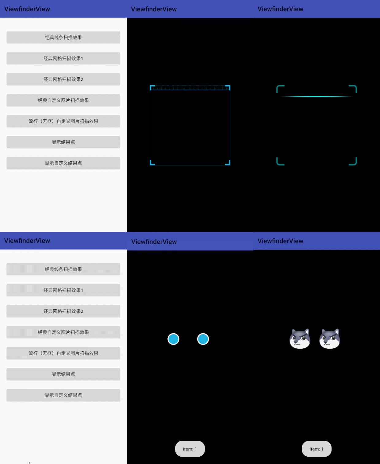
ViewfinderView is a finder view: mainly used to render scan-related animation effects. Its styles are mainly divided into two categories: classic: classic style (with scan box), popular: popular style (without scan box); can be customized arbitrarily.
If you have used ZXing Lite or MLKitpossibly using its internal ViewfinderView.has now ViewfinderView Independently, it is convenient for subsequent unified maintenance.
afterZXing Lite,MLKit,WeChat QRCode will directly use this ViewfinderView As a generic scan rendering view.
Gif display

You can also directly download Demo App experience effect
ViewfinderView attribute description
| Attributes | attribute type | Defaults | property description |
|---|---|---|---|
| vvViewfinderStyle | enum | classic | Viewfinder frame style; support: classic: classic style (with scanning frame), popular: popular style (without scanning frame) |
| vvMaskColor | color | #60000000 | The color of the mask outside the scan area |
| vvFrameColor | color | #7F1FB3E2 | The color of the scan area border |
| vvFrameWidth | dimension | scan frame width | |
| vvFrameHeight | dimension | scan frame height | |
| vvFrameRatio | float | 0.625f | Scan frame and screen ratio, when the width and height of the scan frame are not set, use the ratio to calculate the width and height |
| vvFrameLineStrokeWidth | dimension | 1dp | border line width |
| vvFramePaddingLeft | dimension | 0 | Padding to the left of the scan box |
| vvFramePaddingTop | dimension | 0 | Padding above the scan box |
| vvFramePaddingRight | dimension | 0 | Padding to the right of the scan box |
| vvFramePaddingBottom | dimension | 0 | Padding below the scan box |
| vvFrameGravity | enum | center | Scan frame alignment |
| vvFrameCornerColor | color | #FF1FB3E2 | The color of the corners of the scan area |
| vvFrameCornerSize | dimension | 16dp | The size of the corners of the scanning area |
| vvFrameCornerStrokeWidth | dimension | 4dp | The stroke width of the corners of the scan area |
| vvFrameDrawable | reference | Scan box custom picture | |
| vvLaserLineHeight | dimension | 5dp | Laser scan line height |
| vvLaserMovementSpeed | dimension | 2dp | Moving speed of laser scanning line |
| vvLaserAnimationInterval | integer | 20 | Scan animation delay interval, unit: milliseconds |
| vvLaserGridColumn | integer | 20 | Grid Laser Scan Columns |
| vvLaserGridHeight | integer | 40dp | Grid laser scanning height, when it is 0dp, it means dynamic paving |
| vvLaserColor | color | #FF1FB3E2 | The color of the laser line in the scanning area |
| vvLaserStyle | enum | line | Laser Scanned Patterns |
| vvLaserDrawable | reference | Laser scan line custom picture | |
| vvLaserDrawableRatio | float | 0.625f | Laser scan image and screen ratio |
| vvLabelText | string | Scan prompt text information | |
| vvLabelTextColor | color | #FFC0C0C0 | Prompt text font color |
| vvLabelTextSize | dimension | 14sp | Prompt text font size |
| vvLabelTextPadding | dimension | 24dp | The distance between the prompt text and the scanning area |
| vvLabelTextWidth | dimension | The width of the prompt text, the default is the width of the View | |
| vvLabelTextLocation | enum | bottom | Prompt text display position |
| vvPointColor | color | #FF1FB3E2 | the color of the resulting point |
| vvPointStrokeColor | color | #FFFFFFFF | The color of the resulting point stroke |
| vvPointRadius | dimension | 15dp | The radius of the resulting point |
| vvPointStrokeRatio | float | 1.2 | The ratio of the stroke radius of the result point to the radius of the result point |
| vvPointDrawable | reference | Result point custom picture | |
| vvPointAnimation | boolean | true | Whether to display the animation of the result point |
| vvPointAnimationInterval | integer | 3000 | The animation interval of the result point; unit: millisecond |
Custom attributes related to ViewfinderView are used uniformly vv beginning.
introduce
Gradle:
- in Project build.gradle Add remote warehouse inside
allprojects {
    repositories {
        //...
        mavenCentral()
    }
}
- in Module build.gradle Add the import dependencies inside
// AndroidX 版本
implementation 'com.github.jenly1314:viewfinderview:1.0.0'
example
layout example
For custom properties related to ViewfinderView, see above ViewfinderView attribute description
    <com.king.view.viewfinderview.ViewfinderView
        android:id="@+id/viewfinderView"
        android:layout_width="match_parent"
        android:layout_height="match_parent"
        app:vvLaserStyle="line" />
#ViewfinderView #Homepage #Documentation #Download #Android #finder #view #component #News Fast Delivery