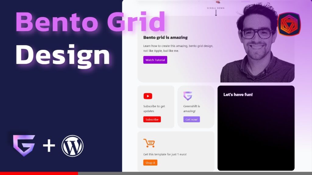
In this video, I’ll show you how to create a stunning website using Bento grid design, one of the hottest trends in web design right now. Bento grid design is inspired by the Japanese Bento Box, which is a box that neatly organizes different types of food. Bento grid design wants to offer you a visually tasty and well-structured layout, making sure every element has its own place and purpose.
Some of the companies that use Bento grid design in their web designs are Apple, DJI, and Procreate. We’ll explore some of their examples and understand how you can use Bento grid design for your next website project.
I’ll also show you how to recreate Bento grid design from a diagram in WordPress, using Greenshift Blocks, which is my current favorite free blocks plugin. You’ll learn how to use hierarchy, spacing, alignment, and contrast to create a balanced and appealing layout.
By the end of this video, you’ll be able to create your own Bento web design that’s not just functional, but also beautifully designed.
See final bento grid:
If you’re as passionate about designing and creating websites as I am, you’re going to love this. So, let’s get to it!
👇 Timestamps 👇
00:00 intro
00:35 What is Bento grid design?
01:01 Examples of Apple Bento grid design
01:38 DJI Bento grid design
03:15 Why Bento grid design is popular
04:00 How to create Bento grid design in WordPress
20:40 Outro
👉 Resources 👉
Final result:
Pre-build bento grid:
Greenshift blocks plugin:
Bento grid design examples:
Apple:
DJI:
Procreate:
👍 If you enjoyed this video, please give it a thumbs up and share it with your friends. 🔔 Don’t forget to subscribe to my channel and hit the bell icon to get notified when I post new videos. 💬 Leave a comment below and let me know what you think of Bento grid design. 🌐 Visit my website for more web creation tips and tricks:
Thanks for watching and keep designing!
