#Wordpress #Tutorial #bricksbuilder #automaticcss #acss
Learn how to easily create a responsive website structure with Bricks Builder and the Automatic CSS plugin in this simple tutorial. Get valuable tips to maximize functionality along the way!
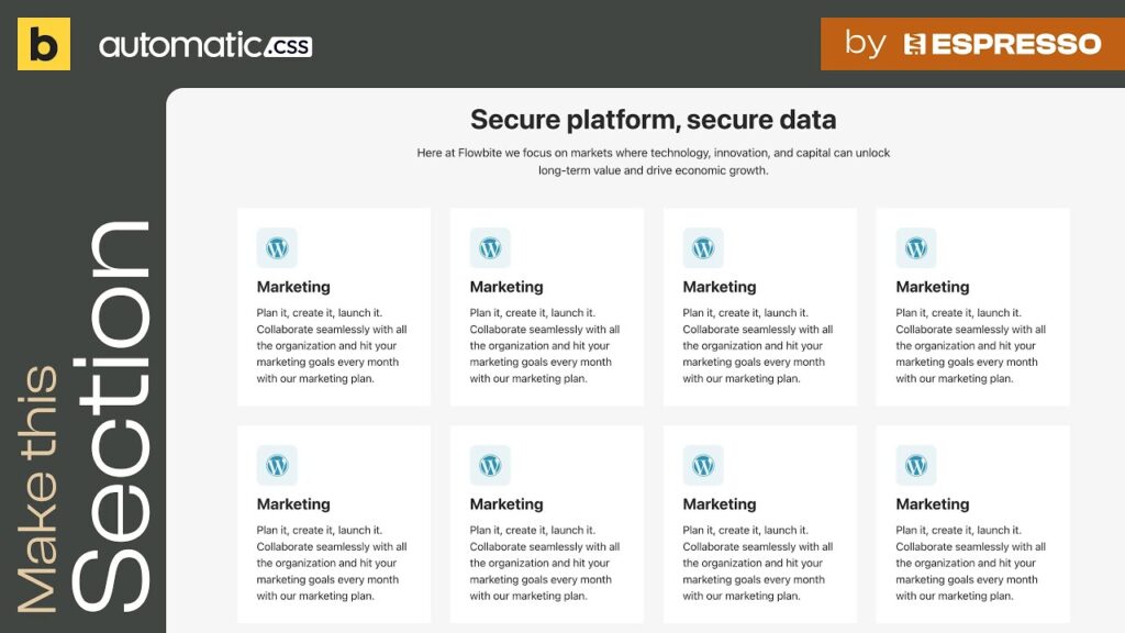
Follow along as we replicate the structure showcased here:
ℹ️ Here’s some information about this tutorial:
👉 I use Bricks Builder and Automatic CSS (ACSS) in these tutorials, check how to set it up here:
👉 During the video tutorial, you’ll observe that, instead of specifying values in px, em, %, etc., I often simply RIGHT CLICK in the input box. This triggers the ACSS popup, offering options for spacing, padding, and sizing. Of course, if you don’t use ACSS like I do, you can manually input values such as px, em, or %.
👉 In the video, you might see me utilizing the “BEM” function found in the layers panel on the right, just after the layer name. This significantly expedites the creation of class names for all nested layers. If you’re not using ACSS, you’ll need to create them manually.
✨ Plugins:
Bricks builder:
Automatic Css:
👌 Hosting I use:
Siteground:
😁 Follow me:
Video teaching group:
Video tutorial:
Dribbble:
Behance:
Linkedin:
Learning course:
